

























Use Themify Builder Global Styles to Keep a WordPress Website Consistent
As a WordPress website grows, small styling differences can accumulate. One button may have a different radius, headings may use slightly different sizes and service cards may have inconsistent spacing. A shared style system makes a site feel intentional and reduces the effort required to update repeated components.
Define a small design system first
Choose a limited colour palette, typography scale, spacing rhythm, button style and image treatment. Write down the rules so editors and designers use the same values. A design system should be small enough to remember and flexible enough to cover the site’s main content types.
Understand Themify Builder Global Styles
Themify Builder includes Global Style controls for setting shared styling on Builder modules. They can help apply a consistent treatment to modules of the same type across layouts. This is useful for common elements such as headings, text modules, buttons and other repeated components. Review the Builder feature overview and official documentation for the available controls.
Start with the components visitors see most
Apply consistent styling to primary buttons, section headings, card titles, body text and image modules. Check how these styles behave in different rows and background colours. Do not force one style onto components that have a genuinely different purpose, such as a warning notice or a compact footer link.
Use a controlled rollout
Before changing global settings across a large site, test them on a representative page. Review the homepage, an article, a landing page and a contact page. Look for unintended changes to module spacing, contrast or layout. Keep a record of the previous values so you can reverse a change if it creates a problem.
Combine global styles with responsive checks
Shared styles should still be readable on mobile. Check heading sizes, button width, line length and vertical spacing at phone and tablet breakpoints. Avoid using fixed dimensions that cause overflow on smaller screens.
Document the rules for editors
Provide a short guide that explains which modules and styles should be used for common content. This reduces the temptation to create a new visual treatment every time someone adds a page. Review the rules periodically as the brand or site structure evolves.
Official Themify resources
Conclusion
Global styles are most useful when they implement a design system that the team has already agreed on. Themify Builder can help standardize repeated module styling, but review changes across real pages and responsive breakpoints before rolling them out widely.
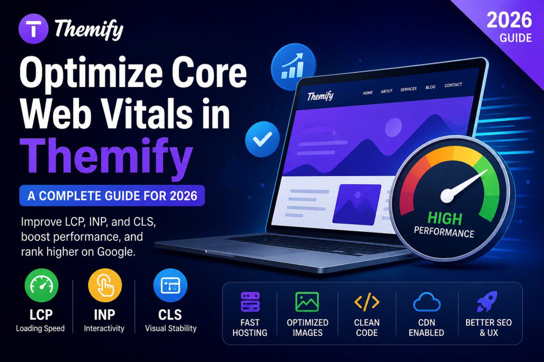
WordPress design system showing shared button, heading, text and card styles. ALT: Themify Builder global styling system for consistent WordPress headings, buttons and content cards.